Laura Nicholas, ND - Brand Identity & Style
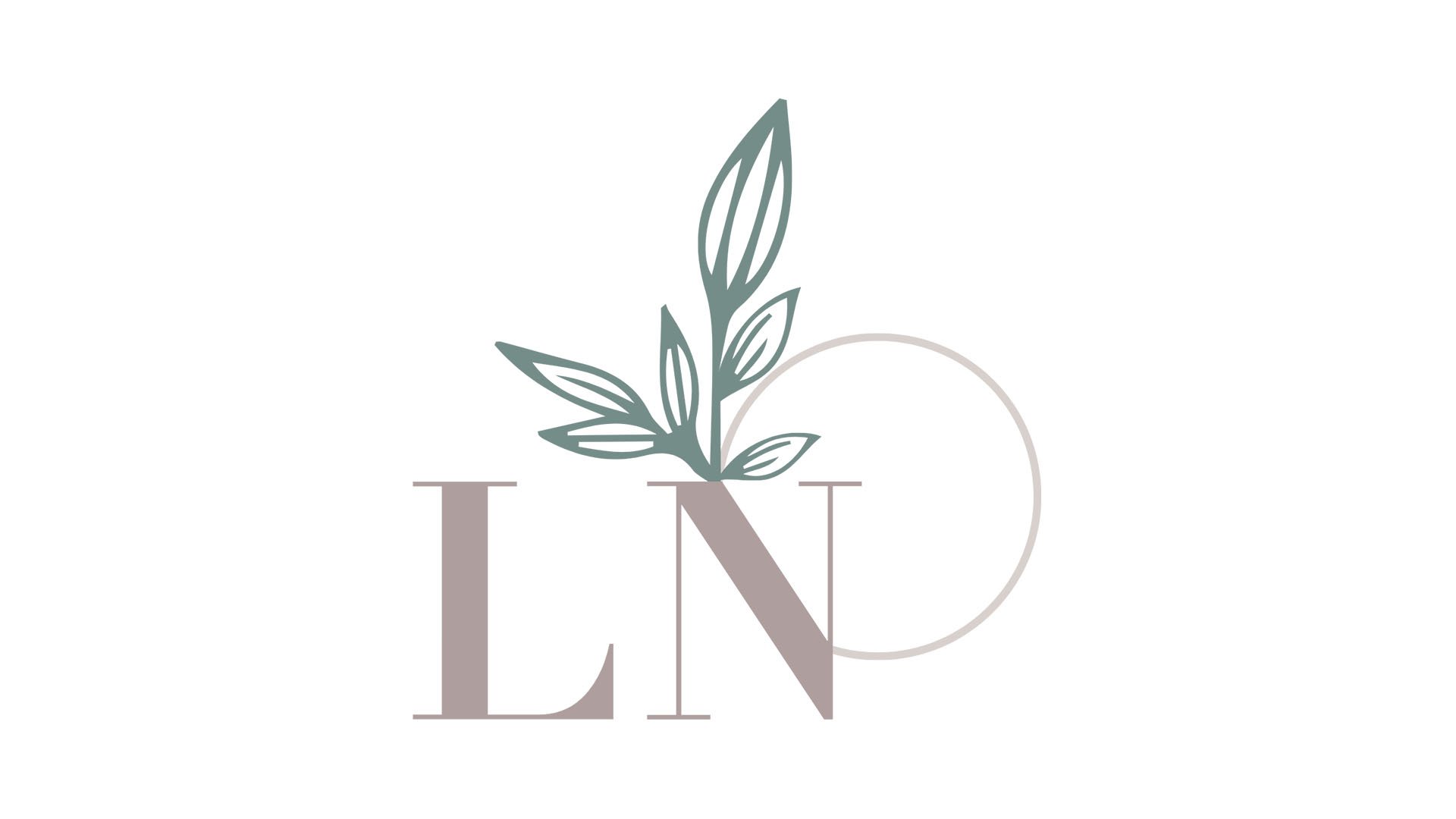
The branding for Dr. Laura Nicholas, a Vancouver-based naturopathic doctor specializing in gynecology and fertility, embodies a unique synthesis of nature, wellness, and the lunar cycle. At the heart of this identity is a monogram of "LN", seamlessly integrated with a raspberry leaf—a symbol of female health and fertility. Intersecting the monogram, a crescent moon enriches the logo, further emphasizing fertility and the natural cycles that influence it. This design choice mirrors Dr. Nicholas' approach: combining cutting-edge science with time-honored natural therapies to support individuals on their journey to parenthood. The brand's essence is captured through adjectives like understanding, warm, open, and holistic, reflecting a nurturing and comprehensive approach to care. The typography—Didot for titles, accompanied by Avenir in various weights—complements the logo's elegance, offering a visual language that is both inviting and authoritative. This identity not only communicates Dr. Nicholas' expertise and empathetic care but also serves as a beacon for those navigating the path to starting a family, symbolizing hope, growth, and the blossoming of new life.


